Data Analysis
Guiding Question
How do we describe the physical properties or characteristics of matter in a precise measurable way?

Units of Measurement
In Class Activity: Stations Activity: Measurement and Conversion Stations
In these stations labs you will work hands on with the different kinds of SI measurements and conversions.
LEARNING TARGETS: Length Stations
-
Define units of length and convert from one to another.
-
Perform arithmetic calculations on units of length.
-
Solve application problems involving units of length.
LEARNING TARGETS: Mass Stations
-
Define units of mass and convert from one to another.
-
Perform arithmetic calculations on units of mass.
-
Solve application problems involving units of mass.
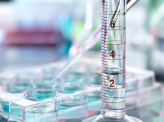
LEARNING TARGETS: Volume Stations
-
Define units of volume and convert from one to another.
-
Perform arithmetic calculations on units of volume.
-
Solve application problems involving units of volume.
Online Interactive Lab: PHET Density
Why do objects like wood float in water? Does it depend on size? Create a custom object to explore the effects of mass and volume on density. Can you discover the relationship? Use the scale to measure the mass of an object, then hold the object under water to measure its volume. Can you identify all the mystery objects?
Scientific Notation and Dimensional Analysis
In Class Activity: Discovery Math: Operations with Scientific Notation
What is scientific notation? Why do we use it? How do we perform mathematical functions with it
LEARNING TARGETS:
-
Define scientific notation.
-
Perform arithmetic calculations using scientific notation.
-
establish applications of scientific notation.
-
Introduce significant figures
How reliable are measurements?
Lab: Measurement Uncertainty
LEARNING TARGETS
-
Familiarize students with the measurement scale of electronic balances, triple beam balances, graduated cylinders, and rulers; to make several different kinds of measurements
-
Compare the uncertainty between these different instruments
-
Concept of human error in measurement
Info Sheet: Rules of Significant Figures
Rules about significant figures may seem arbitrary from a theoretical standpoint, but in the laboratory you will see that they allow you to determine the precision of your measurements and calculations. When your measurement has a limited number of digits, your subsequent calculations will also have a limited number of digits.
Online Interactive: Gridlocks Significant Figures
Gridlock is a puzzle game, requiring you not just to recall the information from class,but also use your problem solving skills to unlock the grid. In this Gridlock each row, column and 2 x 2 box contains a common set of four numbers. Each of the four 2 x 2 boxes will contain numbers with either 1, 2, 3, or 4 significant figures. Based on your understanding of significant figures, move the number tiles into the grid to solve the puzzle and unlock the grid.
Representing Data
Variables
Creating Tables
Independent Variable - The variable you change and controle in your experiment. You may not always be able to manipulate the independent variable. It may be fixed like color, kind, or time
Dependent Variable - What you measure in an experiment and what is affected during the experiment. It "depends" on the independent variable
Example: You are interested in how fertilizer concentrations impact the growth of corn plants. Your independent variable would be the fertilizer concentrations and the dependent variable would be the growth rate of the corn plants. You can directly manipulate fertilizer concentrations in your growing areas and measure how those fertilizer concentrations change the growthrate of corn.
However, sometimes there is no obvious connection between the variables. In other situations we are interested in how the many variables interact with each other.
There are 4 main types of variables
-
categoric variable – described by a word label, not a number, e.g., different brands of paper towel
-
ordered variable – categoric variables that can be put in order, e.g., cool, warm, hot
-
discrete variable – described by whole numbers only, e.g., 1, 2, 3 seconds
-
continuous variable – described by any number or part number, e.g., 42.5°.
The independent variables (if they have been identified) go in the left hand columns, the dependent variables on the right.
The independant variable
Type of paper towel
Amount of water
absorbed
(ml)
The independant variable
-
Any column heading should have all the information needed to define the table's meaning.
-
A categoric variable should include a description of the class.
-
A discrete or continuous variable should identify units and any multipliers (e.g., hundreds of people, millions of dollars, kilometres).
-
The title summarizes what the talbe shows
What a table can tell you
-
A table helps organise information so it is easier to see patterns and relationships.
-
If a variable is continuous the table reveals a lot more information. It may show the range, interval, and number of readings.
Limitations
-
It can be difficult to see numerical relationships and patterns. A graph may make these clearer.
Creating Graphs
Good Graph Bad Graph
Graphs are
-
way of exploring the relationships in dataa
-
a way of displaying and reporting data, making it easier to report patterns and relationships, shapes of distributions, and trends.
Structure
Any graph used to report findings should show
-
the significant features and findings of the investigation in a fair and easily read way
-
the underlying structure of an investigation in terms of the relationships between and within the variables
-
the units of measurement
-
the number of readings (though sometimes these will be in the accompanying text)
-
the range and interval of readings, where appropriate.
Original source: http://arb.nzcer.org.nz/supportmaterials/tables.php
Tips for Good Graphs
-
Give your graph a title. Something like "The dependence of (your dependent variable) on (your independent variable)."
-
The x-axis is your independent variable and the y-axis is your dependent variable.
-
LABELyour x-axis and y-axis. GIVE THE UNITS!!
-
When graphing data from lab, make line graphs because they tell you how one thing changes under the influence of some other variable.
-
NEVER connect the dots on your line graph.
Why? When you do an experiment, you always make mistakes. It's probably not a big mistake, and is frequently not something you have a lot of control over. However, when you do an experiment, many little things go wrong, and these little things add up. As a result, experimental data never makes a nice straight line. Instead, it makes a bunch of dots which kind of wiggle around a graph.
To show that you're a clever young scientist, your best bet is to show that you KNOW your data is sometimes lousy. You do this by making a line (or curve) which seems to follow the data as well as possible, without actually connecting the dots. Doing this shows the trend that the data suggests, without depending too much on the noise. As long as your line (or curve) does a pretty good job of following the data, you should be A-OK.
Original source: http://misterguch.brinkster.net/graph.html
BAD Graph!
Why?
-
There's no title. What's it a graph of? Who knows?
-
There are no labels on the x or y axis. What are those numbers? Who knows?
-
There are no units on the x or y axis. Is this a graph of speed in miles per hour or a graph of temperature in Kelvins? Who can tell?
-
Somebody played "connect the dots". This should be a nice straight line which goes through the points or a curve that tends to follow them.
GOOD Graph!
Why?
Well, look at it! It has a title, labeled axes with units and a line of best fit to show the trend of the data.